WHITE BALANCE
by Alan Lichtenstein
Adjusting White balance is the process of removing unrealistic color casts so that objects that appear white to our eyes are rendered white in your photographs. Our eyes are very good at judging what white is under various light sources, however, our cameras, no matter which camera you have and regardless of whether you have the “best” model or the “entry level” model, don’t do nearly as good a job. Cameras have great difficulty in making the same judgments as our eyes and brain do, particularly when using auto white balance (AUTO). These miscast colors can create unsightly blue, orange or even green color casts. In the days of film, we purchased a particular type of film, designed to take images under different light sources (i.e., daylight, tungsten, fluorescent, etc.). These different types of film designed for an overabundance of one particular color wavelength given by the lighting conditions, prevented, for the most part, unsightly color casts. When we use digital film, we must set the white balance to do what the film had done in the past. Effectively, we are “telling” our camera what white is under whatever lighting conditions we are photographing.
Proper white balance must consider the color temperature of a light source. Qualitatively, this refers to the ‘warmth’ or ‘coolness’ of the light. Quantitatively, this is measured using the Kelvin Temperature scale. This is a temperature scale used primarily by chemists and physicists where 1o C equals 1oK. The table below illustrates the colors of the spectrum with their Kelvin Temperatures:
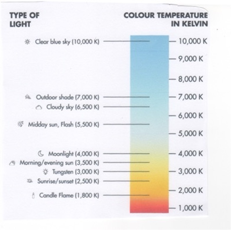
Before going on, a brief understanding of what is meant by ‘warmth’ or ‘coolness.’ In general, we use qualitative terms to refer to ‘warmer’ light containing more wavelengths of red, orange, or yellow of the color spectrum (think fire), and ‘cooler’ light to have more blue, purple, and green (think ice). But those qualitative terms are reversed when one applies the quantitative Kelvin scale. While we would expect that the ‘warmer’ (redder) light to have a higher Kelvin Temperature, it actually has a lower Kelvin Temperature, and the ‘cooler’ light (bluer) actually has the higher Kelvin Temperature. This can be quite interesting if one uses the temperature scale to either add or minimize a certain color of light as the chart below seems to indicate:
As the chart indicates, as the light source appears to get qualitatively ‘warmer,’ (lower Kelvin Temperature), the camera will add more blue so the image’s color is not overly red-orange. The reverse is true for images taken under ‘cooler’ light; the camera will add more red-orange so that the image is not overly blue. Most publications and articles I have seen use the terms “warmer” and ‘cooler” to refer to the qualitative colors rather than the actual Kelvin temperatures. I will follow that use of the descriptive terms to refer to ‘warmer’ colors having more red-orange and lower Kelvin Temperatures and ‘cooler’ referring to images having more blue-purple and having higher Kelvin temperatures.
As you can see from the first chart, neutral light (white), has a relatively equal distribution of all colors (which is why it appears “white”), has a Kelvin Temperature of around 5500oK. Color wise, this is white. But a color source such as an incandescent candle has a far lower Kelvin temperature (around 1800oK), an incandescent lightbulb has a Kelvin temperature of around 3000o, a cloudy sky a Kelvin temperature of around 6750o, and so on. What this means is that the candle has a preponderance of red-orange light, something which you can easily see, the incandescent light has a preponderance of yellow and the cloudy sky has a preponderance of blue light. Using the above chart, if you tell your camera your light source has more blue, it balances the colors by adding a bit more red-orange to enhance those limited colors, consequently giving you a properly color-balanced image. Just as choosing the correct type of film, such as daylight, tungsten, etc. is critical to exposing your image according to the type of available light so that you get an image that accurately reflects the proper colors, in our day of digital, where we don’t use physical film, it’s important to select the proper “digital” film. You do this by setting the proper white balance.
SETTING WHITE BALANCE
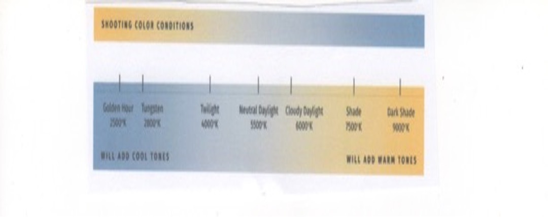
Your camera comes equipped with several PRESET white balances which you can select from. These are commonly called presets. Symbols are the same regardless of which camera you have. Posted below is chart from Olympus, for reference, but these symbols and the Kelvin Temperatures apply pretty much universally:

The above chart gives a good approximation of the color temperatures of the various presets you have available on your camera. The symbols are relatively uniform as to color temperature no matter what brand of camera you have. Some cameras may have additional presets for what they call high key and low keythat give additional choices when the color balance is uneven, but now you should get the general idea.
Two symbols that many may not be familiar with are the “one-touch” and “custom” white balance (WB). A few words about these two. The name “one-touch” is merely the name Olympus gives to the symbol with the two pie-shaped wedges under the rectangle. Your camera brand may give it a different name and whatever name by which it is called is irrelevant. The preset represented by this symbol is what might best be called a vacant preset, meaning you can actually set it. Once “set” that setting is good until you decide to reset it. The other presets, unlike this one, are not vacant and cannot be changed by you. You “set” this vacant preset fundamentally by photographing a piece of white paper under the light available. Your camera manual will tell you the exact steps to follow to “set” these vacant presets. Once “set” it will remain until reset by you. I have generally found that under general conditions the factory-installed presets listed do a pretty good job, but the “one-touch” white balance ( the one you set yourself) is a bit more exact. So, if you don’t have a piece of white paper and can’t set these vacant presets, the standard ones will be OK for you, but if you can set it, it will be better.
I used to carry a piece of stiff white cardboard that I used to set my vacant presets. It is a bit cumbersome to use until I discovered an alternative. The alternative, called an EXO DISC is easier to use. It is a device that you can hang around your neck (it weighs next to nothing) that fits over your lens and can be used to set the vacant presets by placing it over the lens and setting your white balance in the way you usually do by photographing a piece of white paper. After all, that’s all the EXO DISC IS: a piece of white paper inside a circular disc that fits conveniently over your lens. Unfortunately, the alternative is more expensive: $49.99 BP (Before Pandemic).
The other symbol is CWB (Custom White Balance). This setting allows you to dial in the EXACT Kevin Temperature and is by far and away the most accurate white balance setting you can get. But how do you know what this is? Simply put, you measure it. You can download a free app called Light Meter that permits you to point your phone at a light source and it will give you the exact Kelvin Temperature of the light you’re focusing under. You can’t get better than that.
WHY IS WHITE BALANCE IMPORTANT?
Just like in the days of film, if you used the “wrong” type of film, your image came out with color casts. In the digital days, if you use the “wrong” white balance, you also get unpleasant color casts. Just peruse the following two images to see an example.

The image on the left was taken using AUTO white balance. This is a general setting whose algorithm works very well for most conditions, daylight in particular. It’s the one most amateurs regularly use. But tweak those conditions with something say like snow, you get color casts, as the algorithm sees so much of lower Kelvin Temperatures that it adds in more blue; too much blue giving a color cast. That’s why many photographs of snowy scenes come out with a blue cast. The picture on the right was taken by setting the white balance using one of the vacant presets. Clearly, the unseemly blue color cast is gone. Here these images were taken with different cameras, but the effect is what’s important here. So, what’s the moral here? Aside from getting an accurate white balance, be careful of AUTO. It works pretty well, especially in daylight, but if you have an overabundance of one particular color in your image, the AUTO algorithm will “read” that color as the dominant wavelength and add the complimentary wavelength giving you a color cast, even in bright sun, as you can see below.

Here are two photos taken in bright sunlight. The photo on the left, used a custom white balance.
The photo on the right used AUTO. The algorithm for AUTO, ‘read’ the white balance using what it considered to be correct for the entire scene, which it wasn’t due to the overabundance of red of the flowers. Consequently, the algorithm ‘added’ a bit more blue, thinking that color needed to be enhanced. The actual white balance avoided that color cast, since it measured only the wavelength of the red and added just the right amount of cooler colors to accurately represent the scene. So, the moral again is: Be careful of AUTO. Of course, this might have been avoided, had the image on the right been photographed using the present symbolized by the sun.
Knowing a bit about how white balance functions can allow you to “tweak” the white balance to emphasize certain colors without making the image seem unnatural, as illustrated by the following two images:

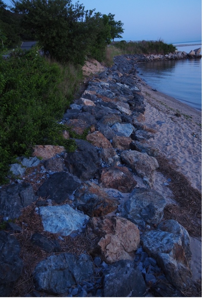
Here’s a couple of images of the rock wall at the Bluffs. Many of the rocks have a white quartz-type mineral that is white, but during the blue hour, can give off a bluish cast. The image on the left was taken at the very tail end of the blue hour using custom white balance measured with the app. You can see a slight bluish cast to some of the rocks. The image on the right, taken scant seconds later, used a Kelvin Temperature approximately 750o lower (meaning I told the camera there was more red-orange in the light). Since I “told” the camera there was more red-orange (which there wasn’t), the camera compensated by emphasizing the blue wavelengths, hence it added more blue to the image, and emphasizing the blue tinge of the quartz rocks at the last gasp of the blue hour. By playing with your white balance, you can emphasize certain colors in the image you are photographing.

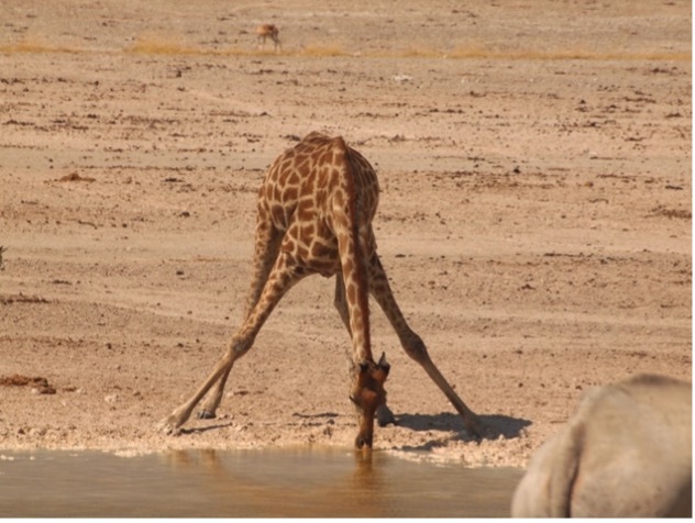
Even if you can’t measure the exact white balance with a custom white balance, you can use the presets on your camera to emphasize colors you might want. Before I began using the piece of white paper to set the vacant present and well before the app to measure the actual Kelvin Temperature came out, I played with the presets I had available to emphasize colors. The image on the left was taken using the preset with the symbol of the sun (bright daylight, which it was). If represents the colors under direct sunlight. But the image had a sandy back and foreground, giving a somewhat lower Kelvin temperature.I wanted to emphasize the orange of the giraffe, so I dialed up the cloud preset, which told my camera there was an abundance of blue light in the image (which there wasn’t) so the camera compensated by emphasizing the orange in the image. So, you can do this even without going very far beyond whatever presets you have set by the factory.
Now, since I generally measure the actual Kelvin Temperature, if I want to get the same effects, a general rule of thumb is that if you want to enhance the blue, lower the Kelvin Temperature between 750o and 1,250o from the measured actual white balance. If you want to add more red/orange, raise your kelvin Temperature between the same intervals. An exact amount can’t be given because the color intensities differ from scene to scene, so you’ll have to take a few images to get the desired one. And this is where a mirrorless camera has it all over a DSLR, because you can change the white balance quickly using one finger while you are focusing through the viewfinder. You generally don’t get to do that as easily with a DSLR.
Both these sets of images demonstrate how you might get an image that might have a color emphasis that you’d want, by using the “wrong” white balance. When conditions of colors and light intensity are good, I sometimes do this.
So, there you have it. White balance is your digital film and the range of Kelvin Temperatures you can adjust to give you infinitely more flexibility than the film photographer had, as he/she was limited by the emulsion that the manufacturer of the film believed the general conditions of the light would be. Knowing how to use white balance is critical not so much for general daylight photography, but indispensable for low-light, blue hour, special scenes such as snow and if you get the chance, the Northern Lights, just to name a few.